
Customize the appearance of the drawer header, cart icon, item count badge, and close button.

Header layout
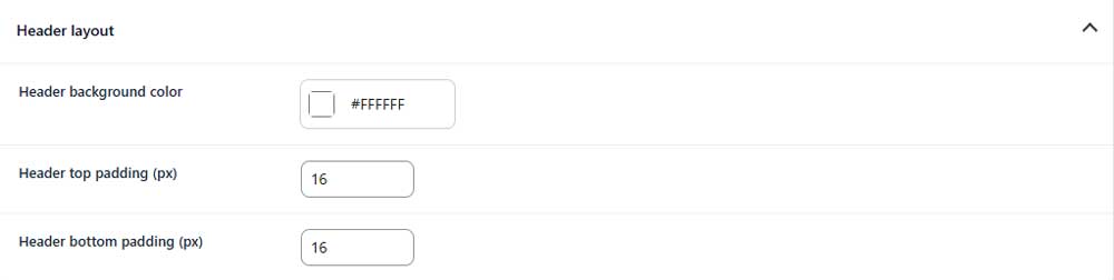
Header background color
Sets the background color of the drawer header.
Header top padding
Controls the space above the header content.
Header bottom padding
Controls the space below the header content.
Heading
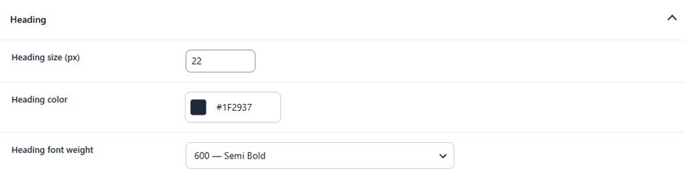
Heading size
Sets the font size of the drawer heading.
Heading color
Sets the color of the drawer heading.
Heading font weight
Controls how light or bold the heading appears.
Cart icon
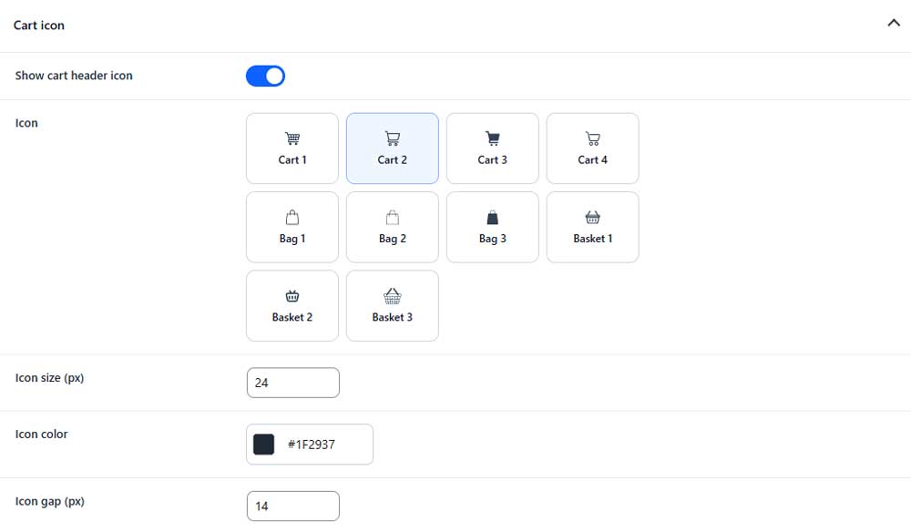
Show cart header icon
Shows or hides the cart icon beside the heading.
Icon
Selects the cart, bag, or basket icon used in the header.
Icon size
Sets the size of the selected icon.
Icon color
Sets the color of the cart icon.
Icon gap
Controls the space between the icon and heading.
Cart count badge
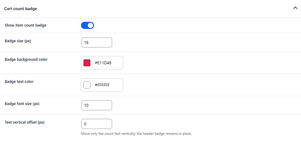
Show item count badge
Shows or hides the number of cart items beside the heading.
Badge size
Sets the width and height of the count badge.
Badge background color
Sets the background color of the badge.
Badge text color
Sets the color of the item count.
Badge font size
Sets the font size of the item count.
Text vertical offset
Moves the count text up or down inside the badge.
Close button
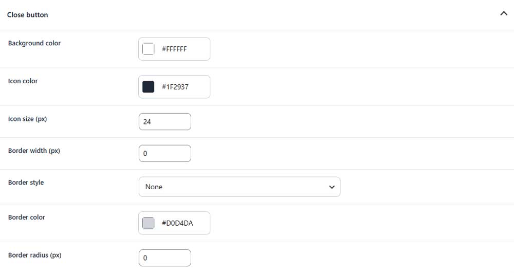
Background color
Sets the background color of the close button.
Icon color
Sets the color of the close icon.
Icon size
Sets the size of the close icon.
Border width (PRO)
Sets the thickness of the button border.
Border style (PRO)
Selects the style of the button border.
Border color (PRO)
Sets the color of the button border.
Border radius (PRO)
Controls how rounded the close button corners appear.