
Customize the coupon form layout, input field, apply button, and success message.

Layout

Inline / Stacked layout
Choose whether the input field and button appear beside each other or on separate rows.
Input field
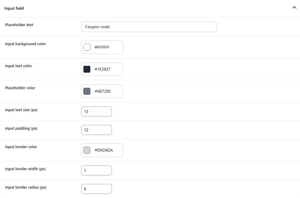
Placeholder text
Sets the text shown inside the empty coupon field.
Input background color
Sets the background color of the coupon field.
Input text color
Sets the color of entered coupon codes.
Placeholder color
Sets the color of the placeholder text.
Input text size
Sets the font size inside the coupon field.
Input padding
Sets the inner spacing of the coupon field.
Input border color
Sets the color of the input border.
Input border width
Sets the thickness of the input border.
Input border radius
Controls how rounded the input field corners appear.
Apply button
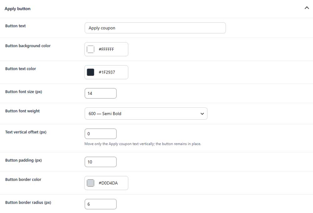
Button text
Sets the text displayed on the apply button.
Button background color
Sets the background color of the button.
Button text color
Sets the color of the button text.
Button font size
Sets the font size of the button text.
Button font weight
Controls how light or bold the button text appears.
Text vertical offset
Moves only the button text up or down.
Button padding
Sets the inner spacing of the button.
Button border color
Sets the color of the button border.
Button border radius
Controls how rounded the button corners appear.
Messages

Coupon success message
Sets the message shown after a coupon is applied successfully.