
Create a menu link or button that opens the drawer cart and displays optional cart information.

Setup
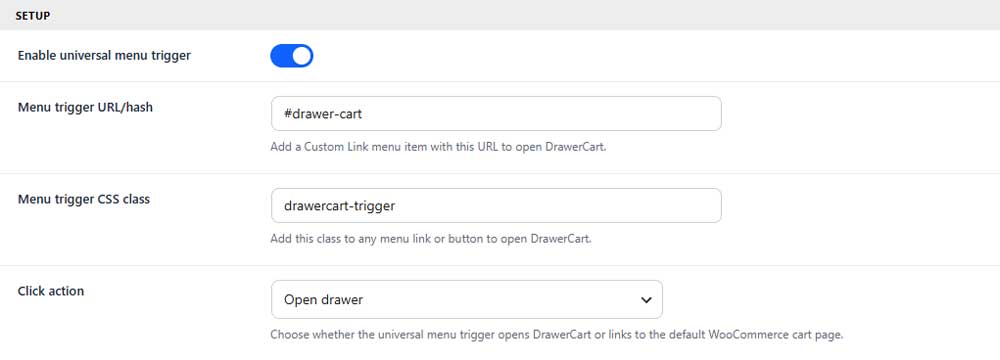
Enable universal menu trigger
Enables the menu trigger feature across your website.
Menu trigger URL/hash
Sets the URL used for a custom menu link that opens the drawer.
Menu trigger CSS class
Sets the CSS class that can be added to any link or button to open the drawer.
Click action
Choose whether the trigger opens the drawer or links to the WooCommerce cart page.
Display
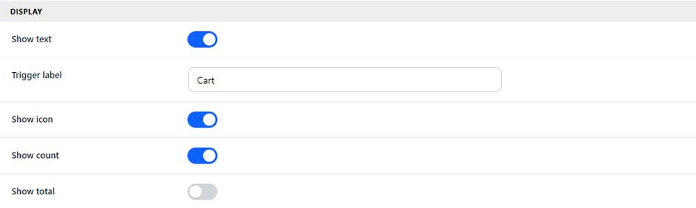
Show text
Shows or hides the trigger label.
Trigger label
Sets the text displayed beside the cart icon.
Show icon
Shows or hides the cart icon.
Show count
Shows or hides the number of items in the cart.
Show total
Shows or hides the current cart total.
Icon
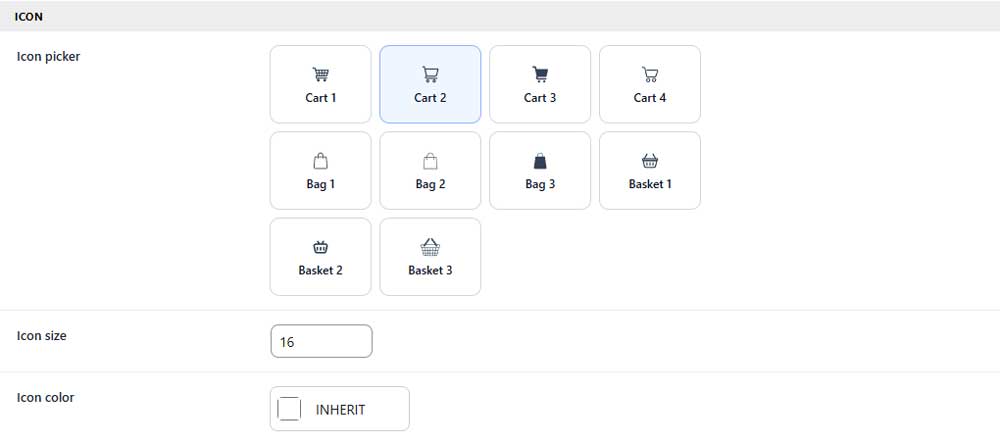
Icon picker
Selects the cart, bag, or basket icon used in the trigger.
Icon size
Sets the size of the selected icon.
Icon color
Sets the icon color or inherits it from your theme.
Visibility

Hide universal trigger when cart is empty
Hides the entire menu trigger when the cart has no items.
Count badge
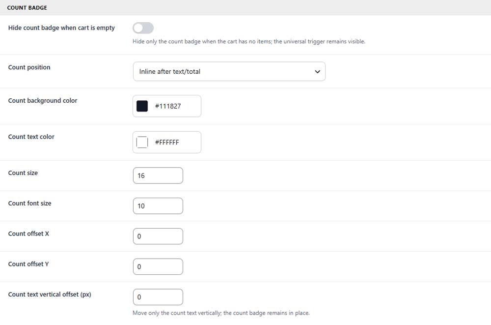
Hide count badge when cart is empty
Hides only the item count badge when the cart is empty.
Count position
Chooses where the count badge appears around the trigger.
Count background color
Sets the background color of the count badge.
Count text color
Sets the color of the item count.
Count size
Sets the width and height of the count badge.
Count font size
Sets the font size of the item count.
Count offset X
Moves the count badge horizontally.
Count offset Y
Moves the count badge vertically.
Count text vertical offset
Moves only the count text up or down inside the badge.
Custom style (PRO)
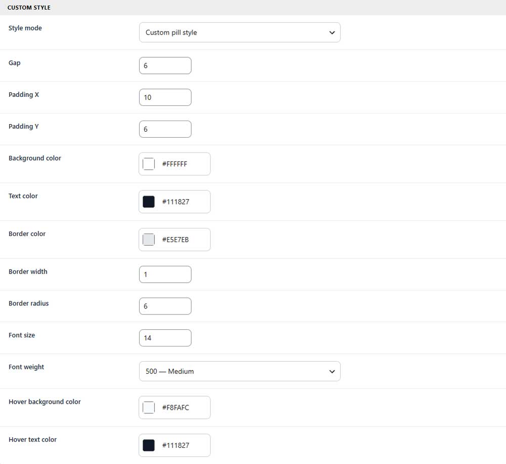
These settings appear when Custom pill style is selected.
Gap (PRO)
Controls the space between the trigger’s icon, text, count, and total.
Padding X (PRO)
Sets the horizontal space inside the menu trigger.
Padding Y (PRO)
Sets the vertical space inside the menu trigger.
Background color (PRO)
Sets the background color of the menu trigger.
Text color (PRO)
Sets the color of the trigger text.
Border color (PRO)
Sets the color of the trigger border.
Border width (PRO)
Sets the thickness of the trigger border.
Border radius (PRO)
Controls how rounded the trigger corners appear.
Font size (PRO)
Sets the font size of the trigger text.
Font weight (PRO)
Controls how light or bold the trigger text appears.
Hover background color (PRO)
Sets the trigger background color on hover.
Hover text color (PRO)
Sets the trigger text color on hover.